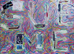
Sue Me
Just be happy I didn't shoot the interim stages on this one. Despite the "high concept" and endless posting (3/5/05 & 4/14/05) about it, I really struggled with the look of this piece. My original slant was quite ethereal, inspired by a book I'd bought for my son when he was born. It was a children's book containing only the lyrics to Imagine, with a lovely cumulous cloud theme and sweet, colorful paintings to accompany each line.
Since the cover art from Imagine is a lynchpin for this painting, I wanted to highlight that theme. Imagine says, what if things weren't the way they are now, what if we didn't kill each other over religion and nationalism? What if we all shared trustingly instead of zealously collecting possessions? Similarly, this piece was supposed to ponder what our culture would be like if it weren't the slave of corporate interests of greed and profit like everything else in our society.
So, my message of cut-outs was surrounded by these pastel cotton candy looking color clouds... it was bad, but I didn't know how to make it better, other than to keep laying on more and brighter and chaotic bands of color. So, like the labels and values I hate so much, I covered everything with a thin layer of silver and gold... the easy way out. That's why you can hardly see the original painting for the glare. You can see that there's a lot of color under the reflective silver, but, metaphorically, it's hard to make out the design under the loud monied shine.
On top of the metal is another design. Meanwhile, with all the art going on near the letters, there's no breach. Sometimes the paint brushes near, but, I never crossed over the letters with paint. They dance around it but don't trespass into the well defended corporate zone. The painting/collage is hard to make out, even in person, but unless you see the piece live, you're missing a lot of the experience, it doesn't photograph well. It's supposed to be seductive, bringing you in, almost deceptively so, unless you have the awareness and knowledge necessary to understand the message.
It takes a while to understand this work. Like any good art, it should be beautiful and enjoyable to look at, regardless of how much you understand the statement it's trying to make. At the same time, if you're willing to participate in the experience, there's lots more to gain... Don't forget to double click the pics...


0 Comments:
Post a Comment
<< Home